Product Design | Strategy
Compelling Experiential Design for MOAA
Presenting history as a living, immersive adventure.
The Solution
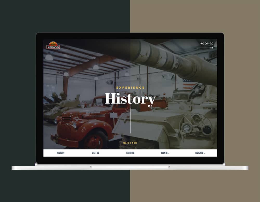
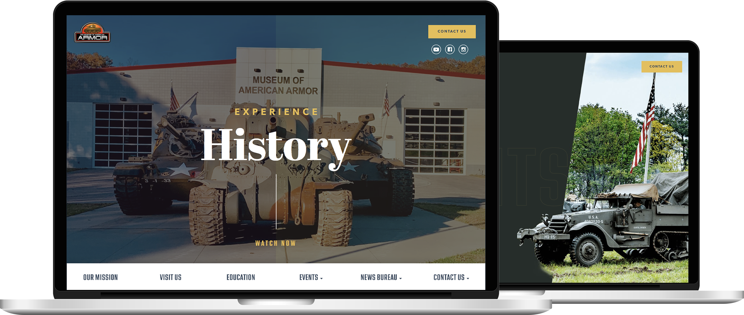
History Reinvented
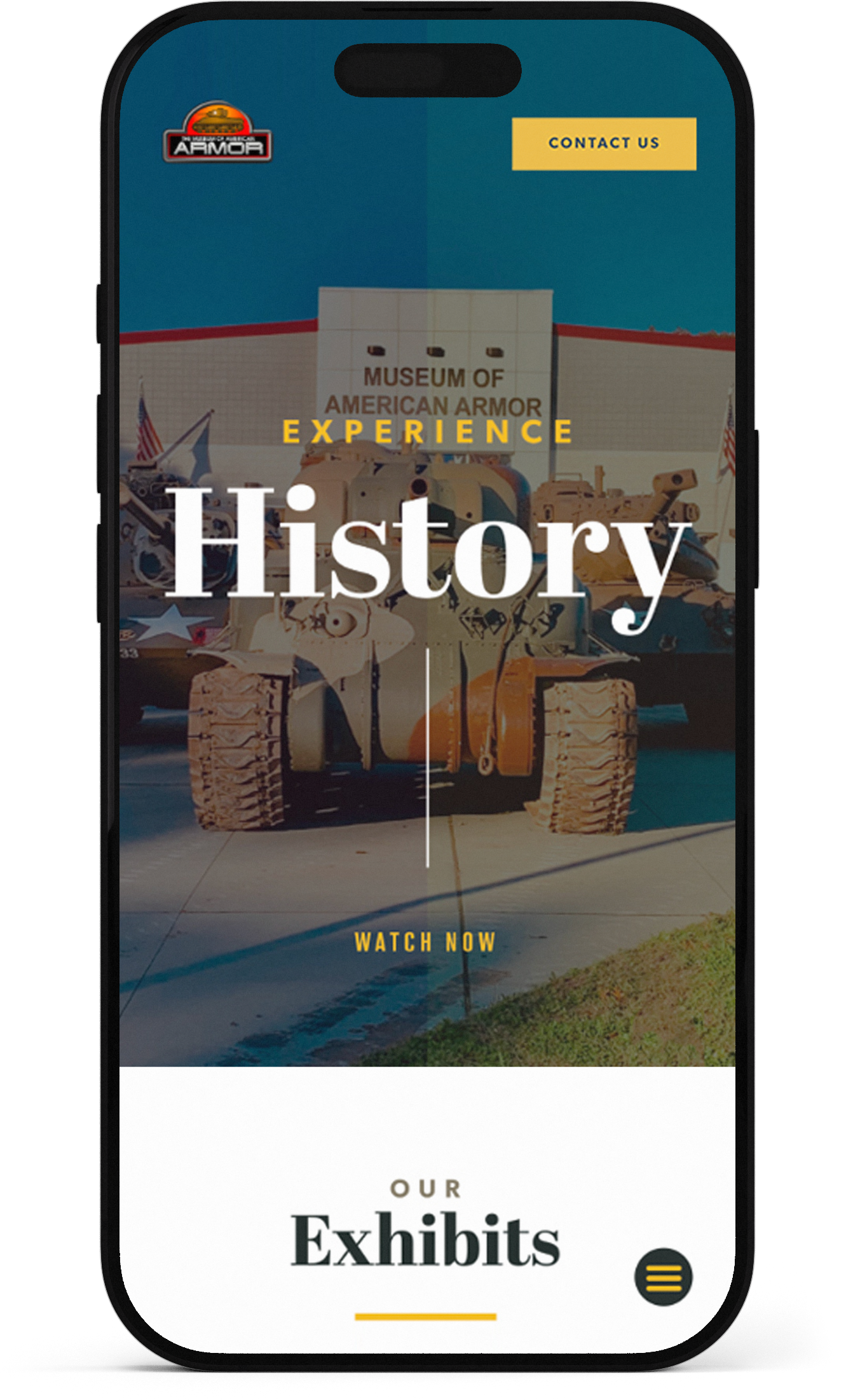
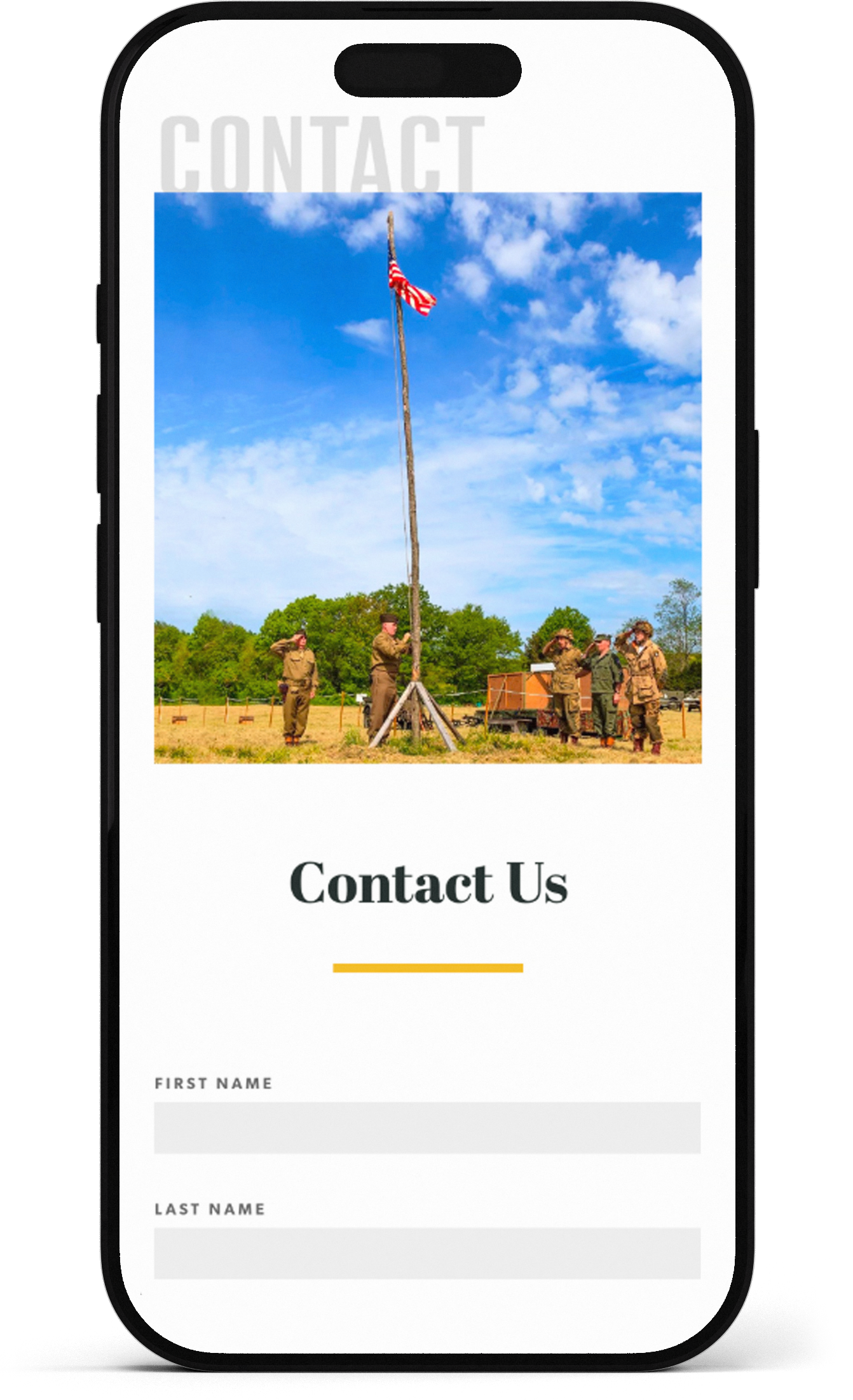
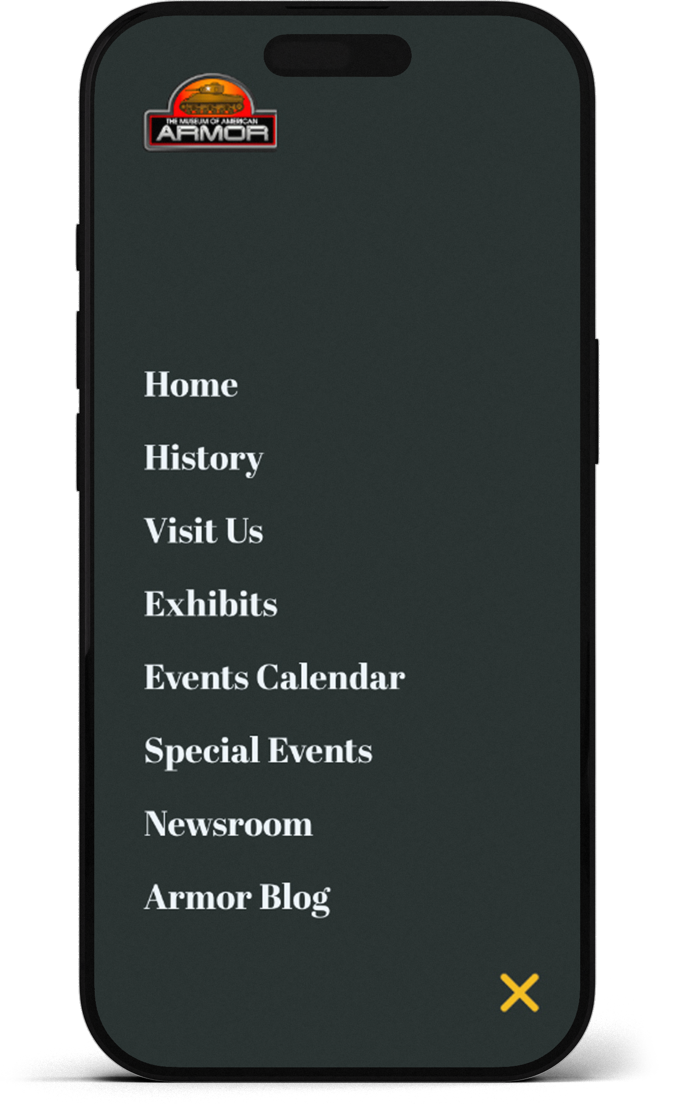
Mobile
Optimized
Responsive design was crucial to help the museum connect with younger audiences and deliver the same engaging digital experience.
Engaging,
Quality Visuals
The redesign effectively communicates a unique experience by prominently featuring images of the museum and its events.
Increased Engagement Opportunities
Forms and calls-to-action for contacting, volunteering, and donating to the museum have been integrated on all pages to enhance user engagement.
The goal of the Museum of American Armor is to immerse a new generation in the sights and sounds of American history, paying tribute to those who have dedicated their lives to defending our freedoms. Through thoughtfully designed exhibits and interactive reenactments, MOAA creates a virtual time machine that brings the story of American courage, valor, and sacrifice to life.
Contributions
Product Design: I created user-friendly layouts and prototypes that emphasized accessibility and aligned with the museum’s goals.
UX Strategy: I optimized navigation, user flows, and CTAs to enhance engagement and create a seamless user experience.
High Level Goals
Capture and tell the MOAA story by creating an engaging and interactive user experience.
Boost engagement and SEO, ultimately driving more visitors and volunteers to the museum.
Role
Senior Designer
Timeline
4 Months
Responsibilities
Product Design
UX Strategy
Collaboration
Project Manager
Client Marketing Team
Stakeholders

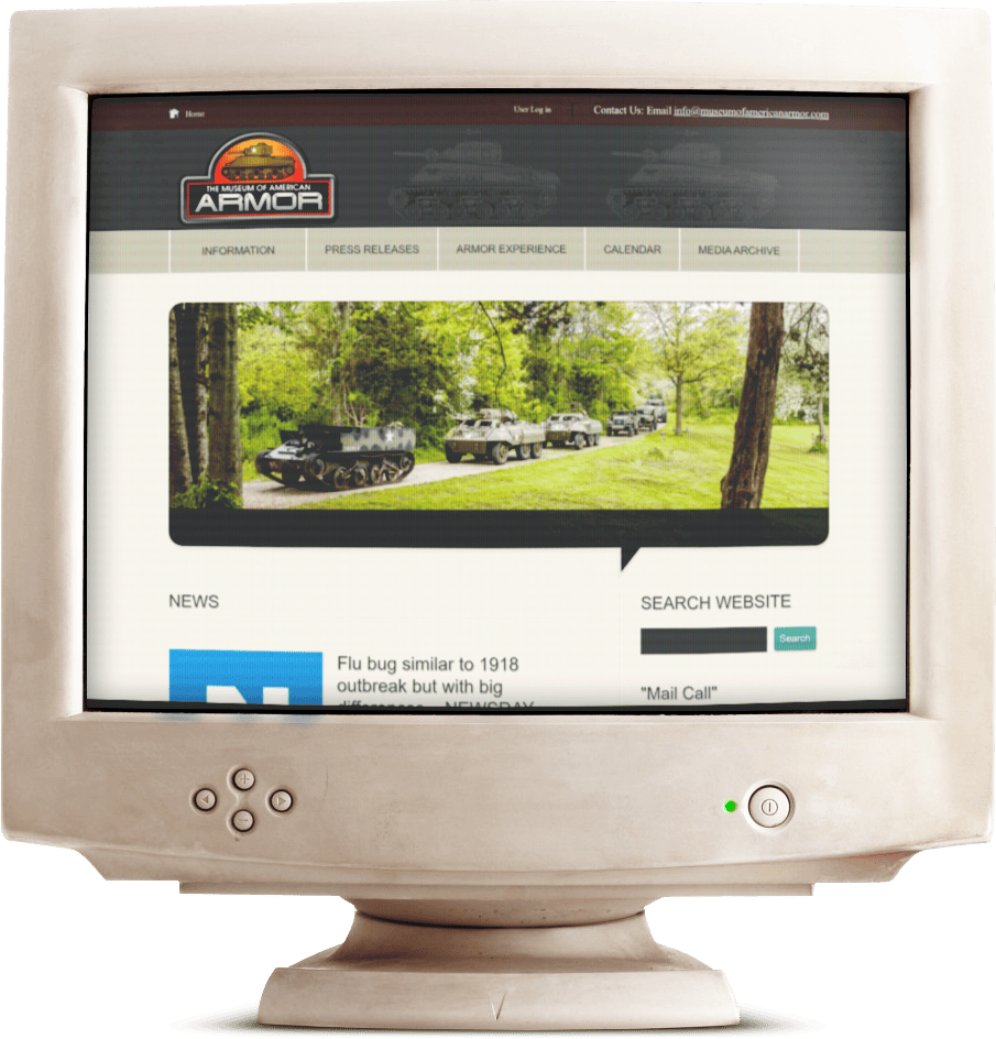
When I began working on the MOAA project, the museum’s website and online presence were severely outdated, hampered by an archaic design and lack of cohesive branding. This poor user experience and weak visual identity were significantly limiting the museum's ability to engage online visitors, attract in-person traffic, and recruit new volunteers.
Key Flaws
Visual Design: The site was stuck in the early 90s, with outdated design fundamentals, weak hierarchy, and ineffective site architecture
User Experience: The site lacked excitement and opportunities for engagement, offering little in the way of immersive experiences or storytelling.
Brand Identity: The museum had virtually no brand consistency or identity, with a dated color palette, typeface, and logo that failed to resonate with modern audiences.
The strength of MOAA lies in the unique experience it offers. My goal was to capture and tell their story by creating an engaging and interactive user experience. I also aimed to boost engagement and SEO, ultimately driving more visitors and volunteers to the museum. This required additional focus on CTA's and accessibility to increase conversion opportunities and search rankings.
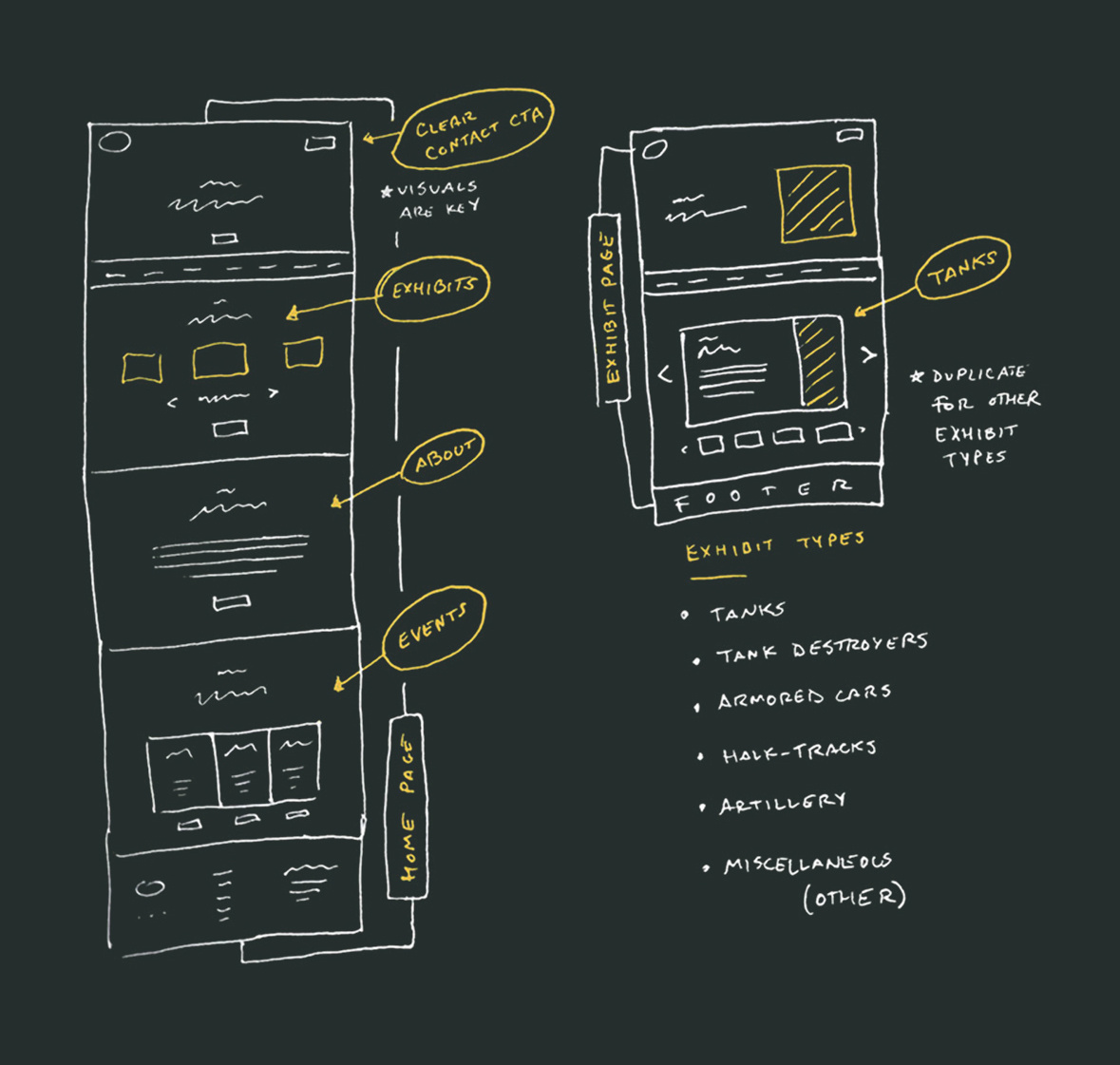
EXHIBITS FEATURE
The museum's most visually and historically significant attraction is its range of operable exhibits (vehicles, artillery, etc.). This needed to be prominently featured above the fold for maximum visibility and interactivity.
VISUALS ARE KEY
Exhibits are best conveyed through visuals. Incorporating high-quality image placeholders in the wireframe was essential, both in the hero section and in the modules below.
REUSABLE MODULES
Each exhibit category includes a coded interactive slider that allows users to shuffle through exhibit information and imagery. This feature provides options for exploration while organizing content in an easily digestible format.

The PROCESS
Discovery
I collaborated with the museum owners and marketing team to define the target audience, key strengths, and immersive experiences to highlight. We also addressed feedback on the old site’s usability and visual shortcomings to guide the new design.
"What feedback have you received about your current website from visitors, volunteers, or staff?"
The website feels outdated, is hard to navigate, and doesn’t showcase our exhibits or provide clear paths for bookings, donations, or volunteering.
"Are there specific actions or conversions you want to prioritize, such as bookings, donations, or volunteer sign-ups?"
We want to drive group bookings, increase donations, and recruit more volunteers to support the museum's mission.
"What emotions or experiences do you want visitors to feel when engaging with your website?"
Visitors should feel inspired and excited, with a deep connection to history and a clear desire to visit or support the museum.
"What are the most significant strengths and unique features of the museum you’d like highlighted?"
Our operable exhibits, like vehicles and artillery, and interactive reenactments make history come alive in a way few museums can.
Persona 1
School Education Coordinator
Age: 45 years old
Location: Huntington, NY
Social Media: Facebook
Communication Preference: Personal Email & Phone Calls
Challenge: Responsible for booking educational trips, Emily needs to find museums that are both educational and engaging for students. She values easy access to group booking information and prefers clear, detailed descriptions of exhibits.
Persona 2
Student
Age: 23 years old
Location: Great Neck, NY
Social Media: Instagram & Twitter
Communication Preference: Text Messages & Social Media Updates
Challenge: A history lover seeking a more modern and immersive experience. Tyler is looking for cutting-edge technology and interactivity, and values museums that offer a fresh, exciting approach to learning about history.
Persona 3
Retired Veteran
Age: 68 years old
Location: New York, NY
Social Media: None
Communication Preference: Phone Calls & Direct Mail
Challenge: As a member of a military family, Robert values history but finds technology intimidating. He struggles with navigating websites that are not user-friendly and needs a simple, easy-to-navigate experience when looking for information about visiting the museum or learning more about exhibits.
To address the client’s primary concern—visualizing the new layout and user flow—I created low-fidelity wireframes for the homepage and exhibit page, the site’s most visited sections. These wireframes helped the client better understand the structure and navigation, ensuring alignment before moving to high-fidelity designs.
FEATURED CTAs
EXHIBITS FEATURE
VISUALS ARE KEY
REUSABLE MODULES
The strength of MOAA lies in the unique experience it offers. My goal was to capture and tell their story by creating an engaging and interactive user experience. I also aimed to boost engagement and SEO, ultimately driving more visitors and volunteers to the museum.
Key Flaws
Visual Design: I introduced a modern, clean design for the website, utilizing effective white space, intentional typefaces, and a cohesive design system to create a visually appealing and user-friendly interface.
User Experience: In collaboration with the Content team, we overhauled the navigation and strategically placed CTAs and forms to enhance user engagement and streamline the visitor journey.
Brand Identity: While the client wished to retain their existing logo, I successfully integrated it into a refreshed brand identity, developing a new color palette, style guides, and consistent layouts that reestablished and strengthened the brand throughout the site.
Color Palette
The palette features military-inspired tones paired with a bold yellow accent, adding a touch of vibrancy and commanding attention while staying true to the museum’s authentic roots.
Primary
#EDBF4A
#847965
Secondary
#252e2d
#FFFFFF
Typeface
A traditional serif paired with a military-inspired sans-serif balances the museum’s historical roots with its modern, immersive experience.

Accessibility
I ensured an inclusive experience by optimizing color contrast, typography, and navigation, while also testing compatibility with screen readers for greater usability.


Following the launch of the redesigned website, user engagement increased by 66%. The strategic interaction design prioritized additional engagement opportunities, such as CTAs and forms, leading to a rise in in-person visitors, donors, and volunteers. By incorporating compelling visuals, users can now clearly see the unique experiences the museum offers, reinforcing its identity as a modern and cohesive brand.
10+
NEW ENGAGEMENT OPPORTUNITIES
(VOLUNTEER, DONATION, ETC)
66%
ENGAGEMENT INCREASE
Key Takeaway
The Importance of Discovery
This project reinforced the importance of thorough discovery in aligning client expectations and user needs. It also gave me the opportunity to solve complex problems, learn new technologies, and apply creative thinking to stay within budget and timeline constraints. The success of the project was largely due to collaborative efforts and clear communication.