Logo Design | Brand Identity
Innovative Branding for Clear Energy Solar
Communicating a modern, tech-forward energy solution.
Logo Design | Brand Identity
Innovative Branding for Clear Energy Solar
Communicating a modern, tech-forward energy solution.

The Solution
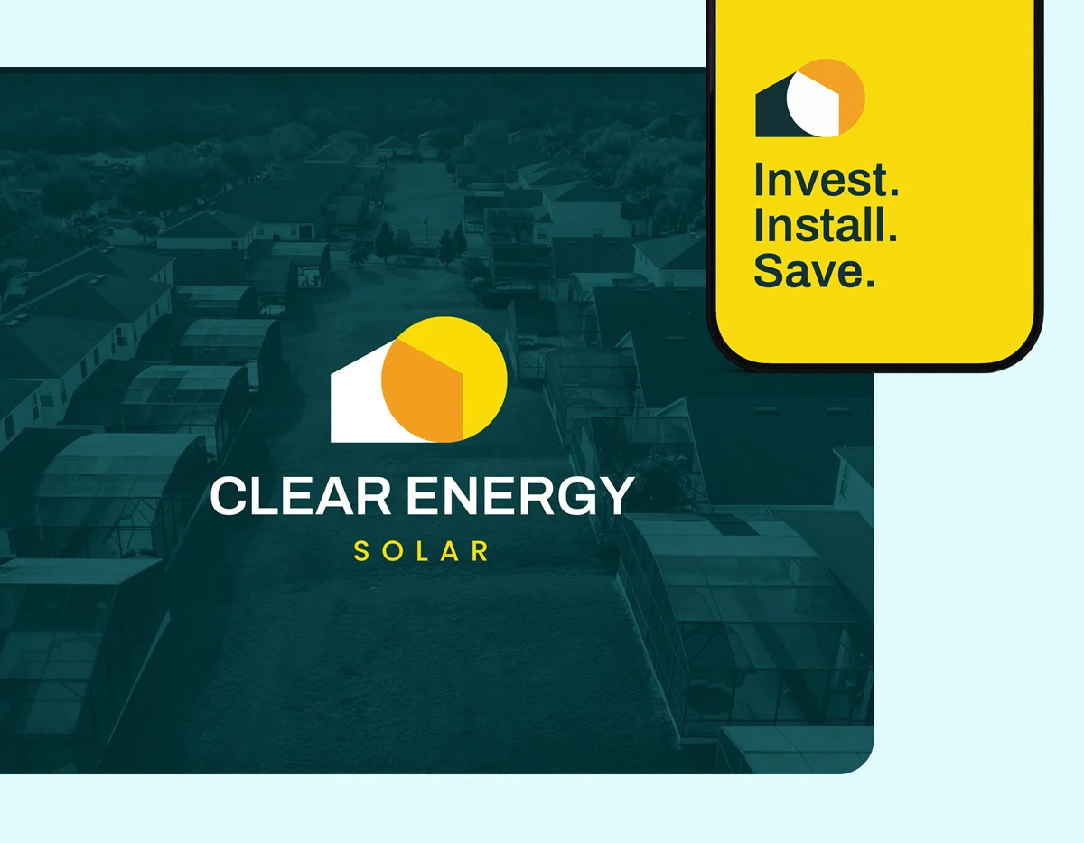
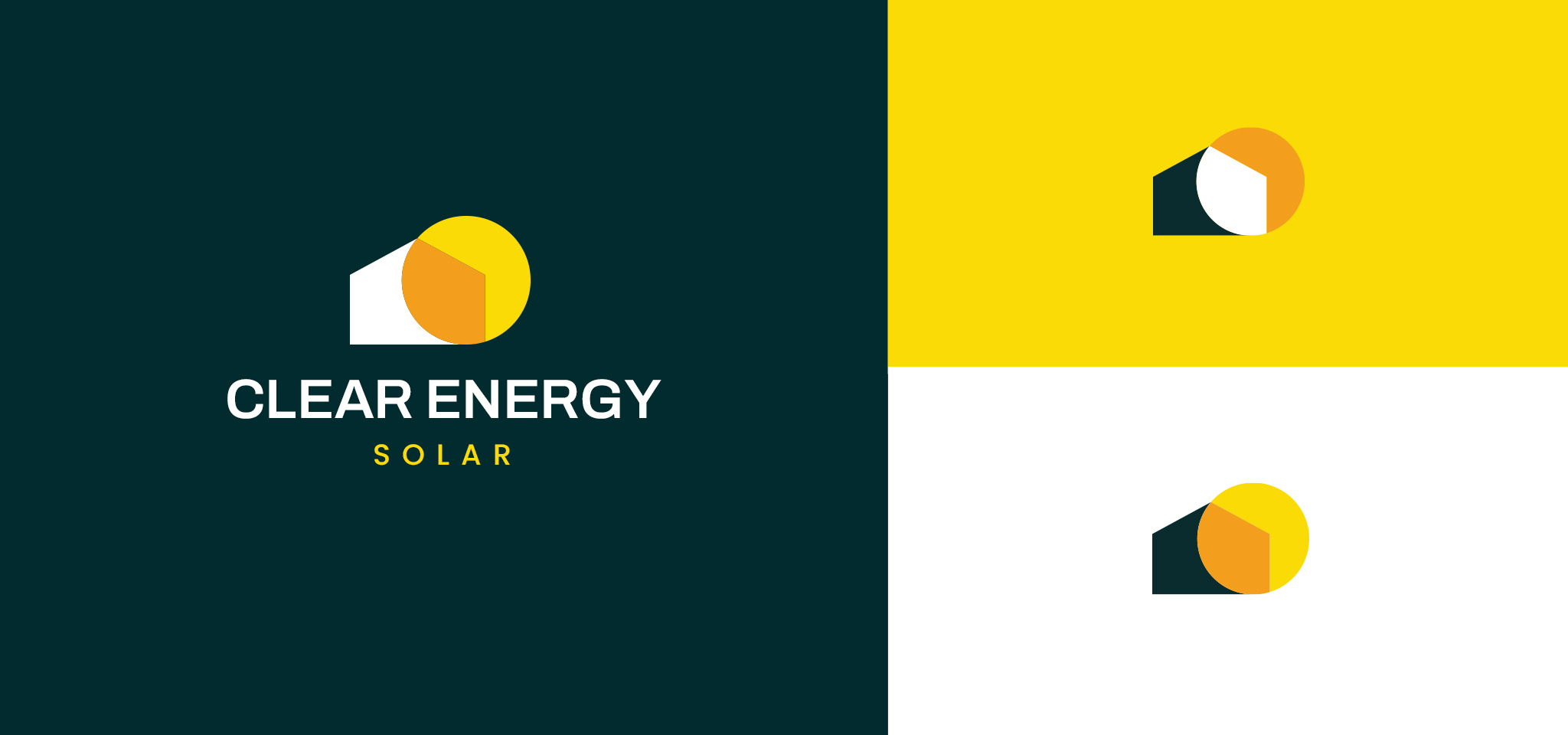
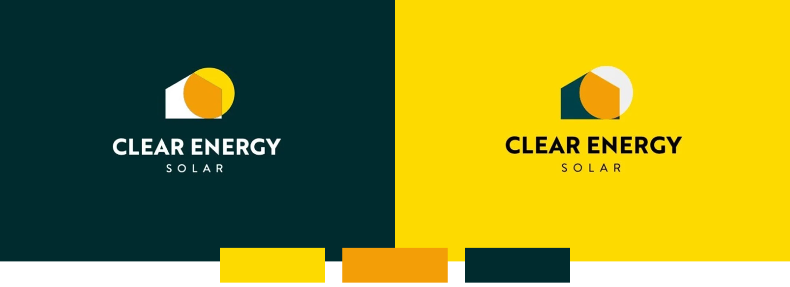
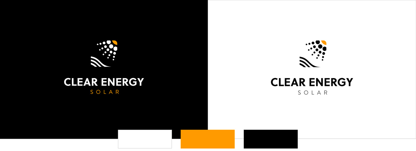
Final Logo
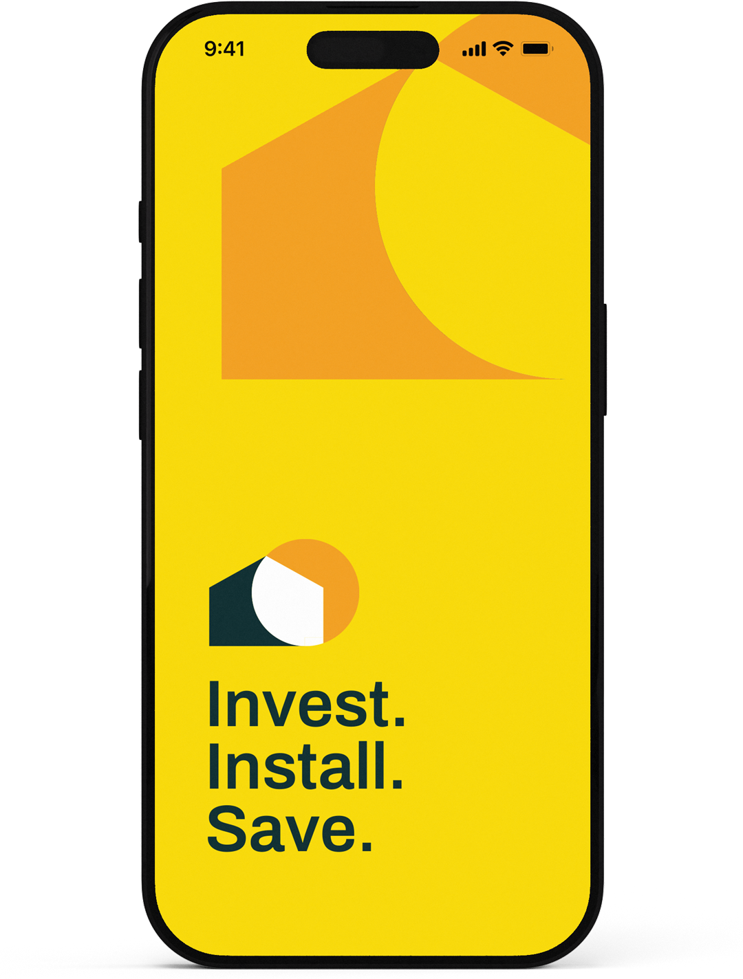
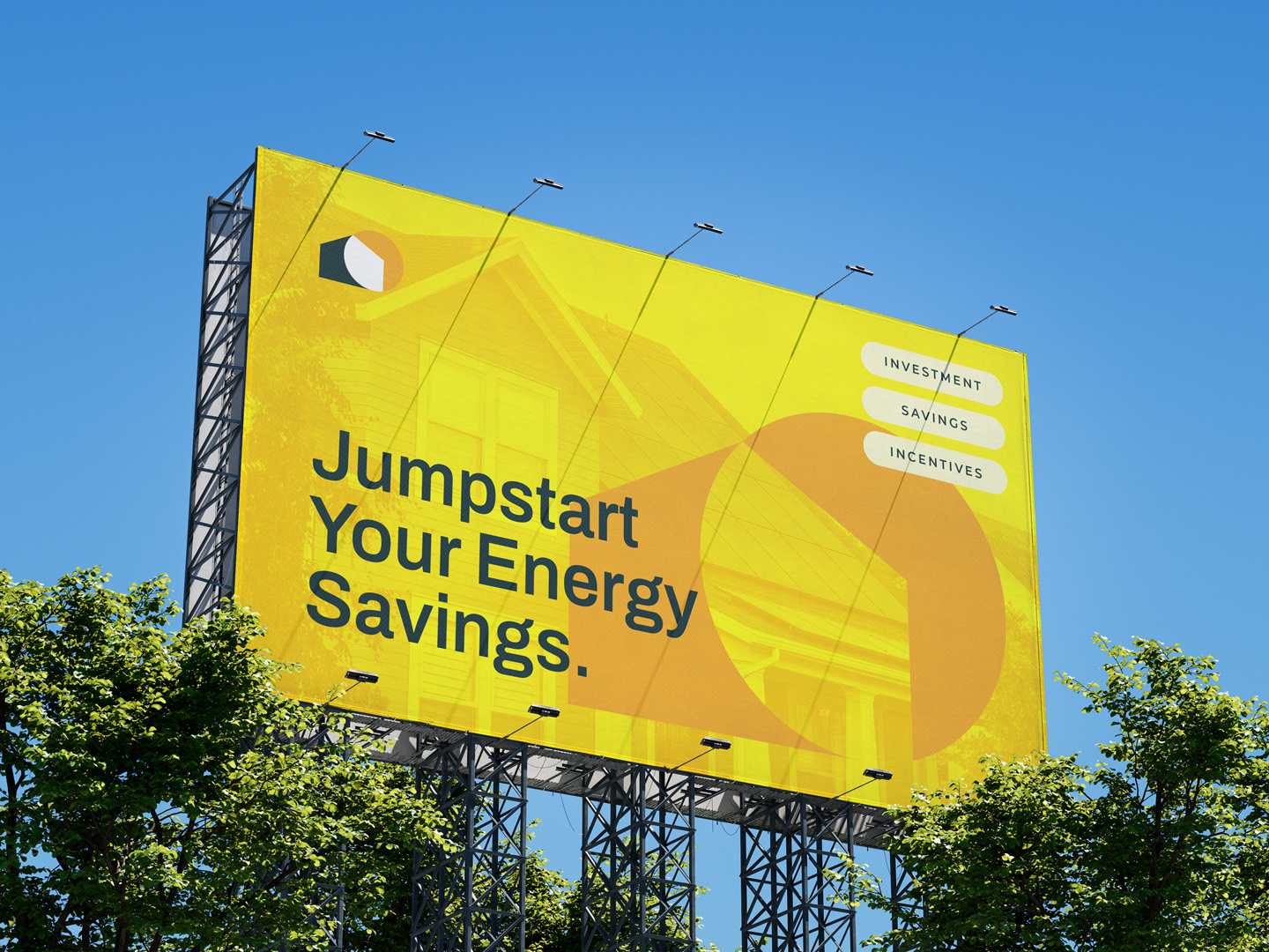
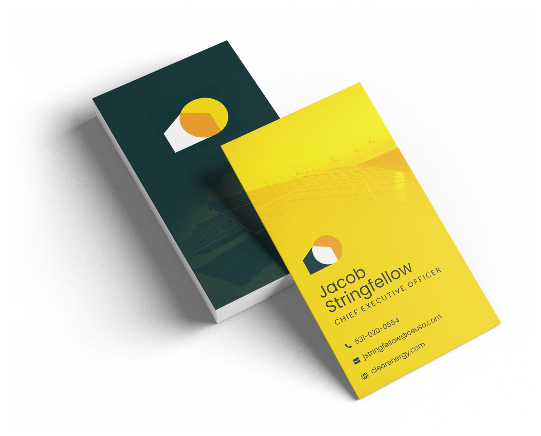
The logo reflects a well-established professional brand, using simple house and sun shapes to communicate the straightforward nature of solar power. The sun’s constant presence symbolizes the reliability and consistency of solar energy as a trusted energy source.

Color
This color palette reflects the key elements of the solar process. The vibrant yellows and oranges draw inspiration from the sun, while the green symbolizes life and earth, both of which are solar powered.
Primary
#012a2d
#ffffff
Secondary
#f49e06
#ffda00
Faded
#819191
#e7c088
#f7de89

Typeface
The typeface conveys a modern, tech-forward aesthetic that aligns with the brand's innovative product. This simpler typography enhances readability while allowing the logo itself to take center stage, ensuring that the overall design feels clean and impactful.
Clear Energy Solar, a premier provider of residential solar solutions in the Northeast, initiated a strategic rebranding in 2020. Despite their high-tech product, the company's digital presence had not kept pace, leading to a misalignment between their actual capabilities and market perception. Recognizing that their outdated branding was likely impacting their sales, Clear Energy Solar decided a change was needed. The rebrand aimed to accurately reflect their innovative solar product and position the company as a forward-thinking leader in their space.
Goal
Develop a fresh brand identity that embodies a modern, tech-forward company, driving increased engagement, conversions, and sales.
Role
Lead Designer
Timeline
2 Months
Responsibilities
Logo Design
Brand Design
Design Systems
Clear Energy’s immediate priorities included designing a new logo and developing updated visual/brand guidelines, incorporating fresh typography and color palettes. During the onboarding process, I was encouraged to explore my creativity to deliver a bold, innovative design. This level of freedom can be both challenging and exciting, so I focused on the latter and got to work.
Key Flaws
Antiquated Logo
Uninspiring Typography
Outdated Color Design
OLD LOGO

Color Palette
#183e8a
#7cb470
#83b2f9
#f3deb3
Clear Energy’s vision called for a complete brand overhaul, not just a refresh. Since solar and energy are often associated with orange and green, these colors provided a natural foundation. I wanted to introduce a bolder, high-contrast palette to reflect their innovative, tech-driven focus. By pairing vibrant colors with strong sans-serif fonts, I could craft a modern and cohesive brand identity that aligned perfectly with Clear Energy’s goals for the future.
Modern Logo
The old logo had a dated clip-art icon and sloppy layout. We needed a modern, structured design with a bold icon that could stand on its own and represent the brand.
Tech-Forward Typography
The brand's outdated serif fonts conveyed old technology. We needed a modern font to reflect innovation and communicate a cutting-edge, tech-forward product.
Engaging Color Scheme
The previous navy, green, and yellow color scheme lacked contrast. We needed to refresh the palette with bolder colors to create more visual impact.
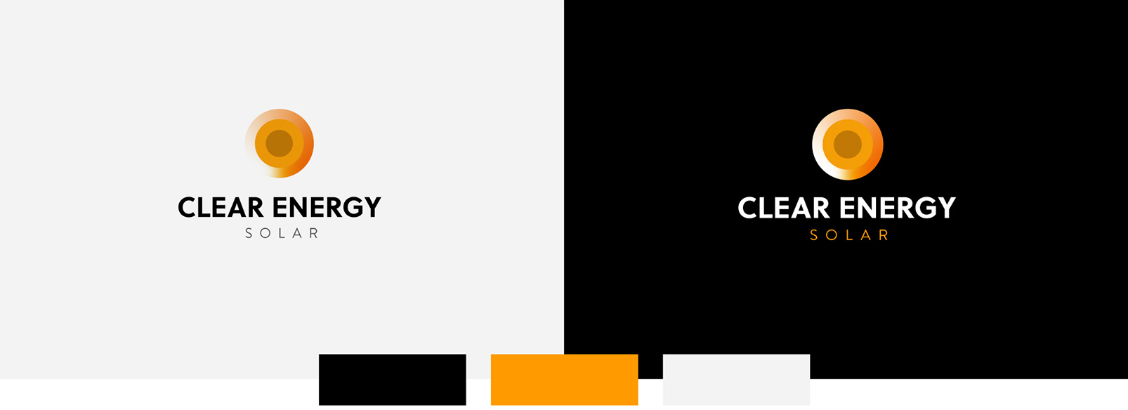
I recognized the need to present a wide range of options for this client, as they specifically requested multiple designs with varied color schemes. I developed several logo concepts inspired by key solar elements like the sun, panels, homes, and energy. With minimal direction provided, I explored a range of styles—from minimalistic to abstract and literal—to offer diverse, creative concepts.


The PROCESS
First Concepts
Clear Energy’s vision called for a complete brand overhaul, not just a refresh. Since solar and energy are often associated with orange and green, these colors provided a natural foundation. I wanted to introduce a bolder, high-contrast palette to reflect their innovative, tech-driven focus. By pairing vibrant colors with strong sans-serif fonts, I could craft a modern and cohesive brand identity that aligned perfectly with Clear Energy’s goals for the future.
After presenting the concepts, I was eager for the client's feedback. However, things took an unexpected turn—the client strongly disliked the designs and gave blunt, direct criticism...
"I see no creativity here!"
"Nothing stands out, these miss the mark."
Discovery
At first, I experienced a mix of frustration, confusion, and doubt. After taking a moment to gather my thoughts, I recognized the importance of understanding the client’s perspective more deeply. I began asking discovery questions to gain further insights into their preferences and expectations.
The answers to these questions provided valuable clarity on the client's feedback regarding the initial logo designs. With fresh insight and a more comprehensive understanding of their vision, I was ready to approach the second round with a more focused and refined strategy.
"Could you share any examples of websites or social media profiles that reflect the style or tone you're aiming for?"
"What emotional response or experience do you want users to have when they engage with your brand?"
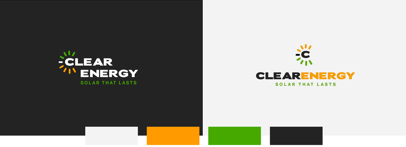
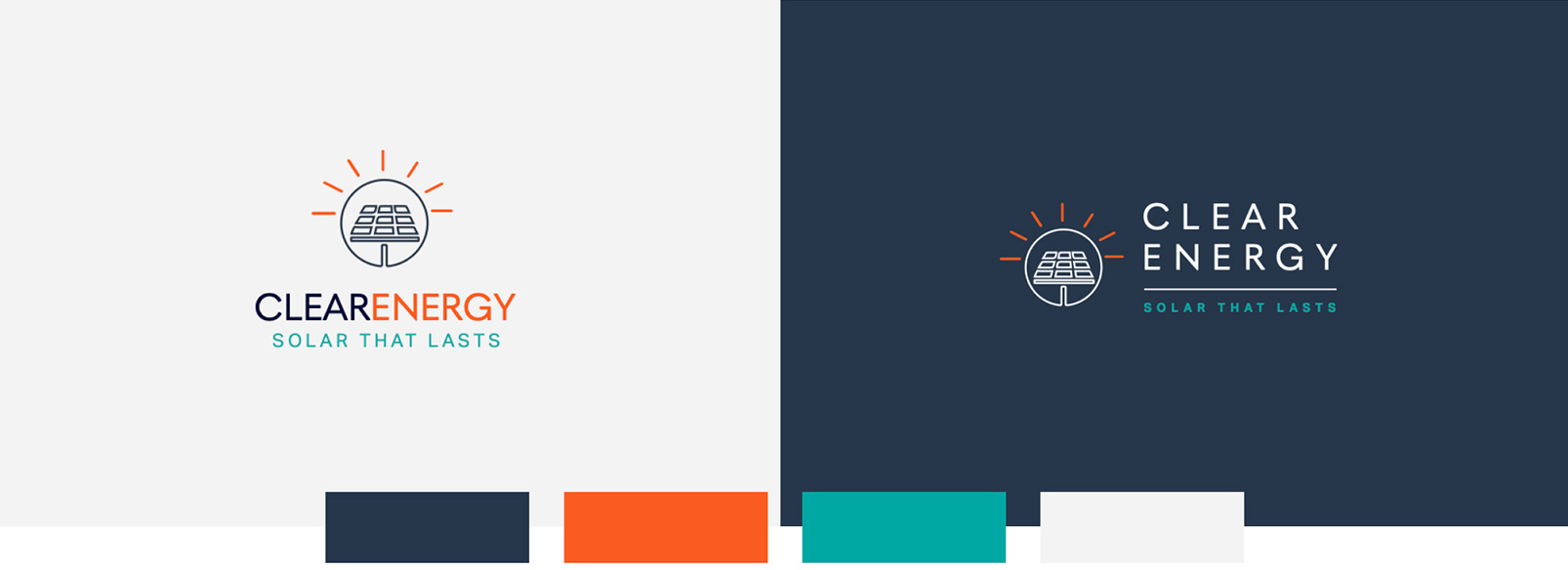
The PROCESS
Round Two
I created four new sets of concepts based on the insight I gained from the discovery questions. For this set, I refreshed my approach by using negative space and rounded shapes for a different, more modern look.

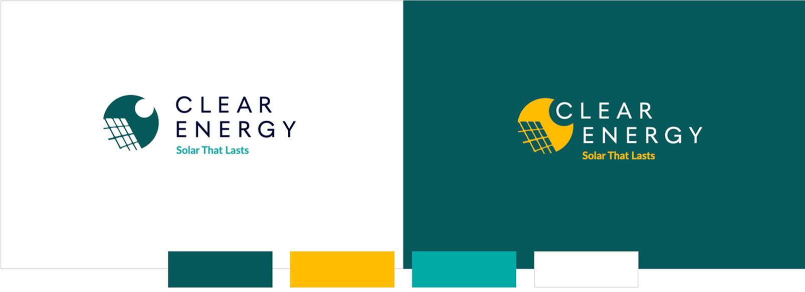

Working with this client proved to be a continuous challenge. After several more rounds of logo concepts, they ultimately opted for an in-house design—a simple font change to their existing logo. While this process was frustrating, it became an opportunity to adapt by using their chosen logo to build out the rest of their brand identity, redesigning their website, and developing a variety of assets including brochures, blog graphics, business cards, social ads, and email templates. This experience taught me that collaboration isn't always smooth, but it's essential for growth. Though the outcome wasn’t what I initially envisioned, the lessons learned have strengthened my ability to navigate challenging client relationships and deliver impactful solutions.
Breaking News!
While not a typical success story, this case study highlights key lessons in project development. It shows the importance of the discovery stage and client feedback.
Key Learning
Importance of Early Product Discovery
I learned that engaging in early product discovery is essential to avoid wasting valuable resources and time. I’ve found that asking discovery questions not only clarifies the project request but also helps clients communicate their preferences. This collaborative approach fosters a deeper understanding of their vision and leads to more effective design solutions.